Tuesday, October 7, 2014

4 Designs Book Cover

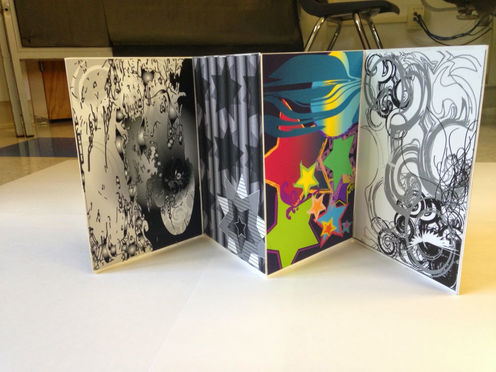
This is the cover to my 4 designs book. It is titled Please Elaborate because the theme of my design book is very chaotic and random. I used a lot of vibrant colors. They are the same scheme as my color design. I used a piece of my line design in the background with a gradient just like I did in my fills design.

Tuesday, September 30, 2014

Color scheme

These are the colors I used in my color design. I used what is called the square color scheme.

The colors used are different shades of: Red, Orange, Blue, and Yellow

Monday, September 29, 2014

4 designs books

These are four designs I had come up with. In the line design the focal point is the white wing-like pattern overlapping the black swirls.  I used shapes and gradients and actually put my line design with gradients underneath a live trace to make the face stand out in the Shapes/ fills picture. The star to the top left is the focal point of the pattern fills design. It is bigger than the rest of the stars. I also used different lighter patterns that I custom made to have it stand out. In the last picture (color) the focal point is the circle with the gradient as well as the star with the gradient. The are covered with a blue shape that also has a gradient. They stand out because they are the only shapes with gradients.

Wednesday, September 17, 2014

Stefan Sagmeister

I chose the artist Stefan Sagmeister because I find his work interesting. I like that it is controversial and provokes emotion. These are four pieces of his work that I find particularly intriguing. I am most inspired by his way of creating a bigger message through many pieces of artwork.
This picture and "Always" are both parts of a bigger message that was in an Austrian magazine spread. There are a series of pictures with different words which spell out, "Having guts always works out for me."


This creation is called "Obsessions Make My Life Worse but My Work Better" Sagmeister goes on to describe how this illustrates that he doesn't really obsess over much but his artwork.


Tuesday, September 16, 2014

The Butterfly Effect

This is my Vote for the Environment poster. The visual texture in the background is actually a butterfly wing. I used color swatches to create the boldness in the poster. I used complimentary colors as well as contrasting colors to create movement in the poster. I used a gradient to make the words stick out from the background.
And I shared it! Here's a screenshot!^.^